When you check your mail, what happens? You pick up a stack of envelopes and flyers, and your fingers do the sorting before your eyes even focus on the text. You instantly filter out the flimsy, cheap-feeling paper. It feels like junk, so you treat it like junk. But then, you touch something sturdy a card with a rigid snap and a smooth, premium finish. You stop. You look. That is the power of choosing the right paper.
In my years running a printing and marketing service, I have seen countless businesses spend thousands on graphic design and copywriting, only to fumble at the finish line by printing on sub-par paper. The paper stock you choose is not just a canvas; it is the physical handshake of your brand. It communicates reliability, quality, and professionalism before a single word is read.
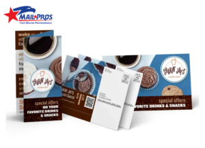
If you are looking to elevate your next campaign, understanding the nuances of Postcard Printing is essential. In this guide, I will walk you through the paper weights, finishes, and textures that actually work in the mail stream, helping you avoid common pitfalls and maximize your return on investment.
The Flop Test: Why Paper Thickness Matters
In the printing world, we talk a lot about points (pt) or cover weights. If you are not in the industry, these numbers can feel abstract. However, the physical difference is immediately noticeable. The most common mistake I see small business owners make is choosing a paper stock that is too light something akin to a heavy magazine page rather than a stiff card.
When a potential customer holds your postcard, it should not flop over under its own weight. We call this the flop test. A 10pt or 12pt card often feels flimsy and disposable. For a standard direct mail piece, I almost always recommend starting at a 14pt cardstock. This is the industry standard for a reason; it is thick enough to survive the postal sorting machines without creasing, yet cost-effective for bulk mailings.
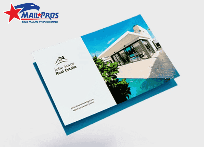
If you are selling a luxury product, such as high-end real estate or boutique jewelry, 14pt might not be enough. Stepping up to a 16pt or even an 18pt ultra-thick stock changes the psychology of the recipient. It feels substantial, like a keepsake or a VIP invitation. In my experience, that extra fraction of thickness can significantly increase the keep rate of your marketing piece.
Decoding Paper Finishes: Gloss, Matte, or Uncoated?
Once you have settled on the thickness, the next major decision is the coating. This isn’t just about aesthetics; it’s about functionality and how the ink interacts with the paper fibers. Over the years, I’ve helped clients match their industry to the right finish, and the results speak for themselves.
The High-Gloss UV Coating
Glossy paper is the extrovert of the paper world. It reflects light, makes colors scream for attention, and provides a sharp, high-contrast look. If your postcard relies heavily on photography think pizza close-ups, travel destinations, or colorful retail products gloss is your best friend.
A High-Gloss UV coating also adds a layer of protection. It creates a slick surface that resists scuffing as the card travels through high-speed mail sorters. However, keep in mind that gloss is notoriously difficult to write on. If your call-to-action involves the recipient filling out a form, gloss will result in smeared ink and frustration.
The Sophisticated Matte Finish
Matte finish is currently the darling of modern design. It offers a dull, non-reflective surface that feels smooth and velvety to the touch. I often recommend matte for law firms, financial advisors, and luxury brands because it exudes understated elegance. It says, I don’t need to shout to get your attention.
From a practical standpoint, matte is easier to read under bright lights because there is no glare. It also resists fingerprints better than high-gloss. If your design relies on typography or muted color palettes, a matte finish will preserve the integrity of the design without the artificial shine.
Uncoated Stock for a Natural Feel
Uncoated paper has no chemical sealant on the surface. It feels like raw, high-quality cardstock. This is the absolute best choice if you need to write on the card with a pen or pencil. We often use this for appointment reminder cards for dentists or doctors.
Uncoated stock also implies a sense of organic authenticity. Sustainable brands, organic food companies, and artisanal crafters often gravitate toward uncoated stock because it feels real. Just be aware that ink soaks into uncoated paper, which can make images look slightly softer and less vibrant than they would on coated stock.
Navigating Postal Regulations and Durability
There is a logistical side to paper selection that many designers forget: the United States Postal Service (USPS) machinery is brutal. Your beautiful postcard is going to be sandwiched between heavy catalogs, bent around rollers, and shot through sorters at high speeds. If the paper is too thin, it will tear or jam.
Beyond just survival, the paper needs to meet specific thickness requirements to qualify for automation rates. If a card is too flimsy, the post office may reject it or charge you a higher postage rate because it requires manual handling. This is especially true if you are utilizing custom EDDM solutions.
Every Door Direct Mail (EDDM) usually requires a specific rigidity to be bundled and delivered by carriers. Using a sturdy 14pt or 16pt stock ensures your campaign hits mailboxes looking as crisp as the day it came off the press. It protects your investment in postage by ensuring the piece is actually deliverable.
Design Synergy: How Ink Reacts to Different Stocks
I often sit down with clients who bring in a design on their iPad, where the colors are backlit and neon-bright. They are disappointed when the printed piece looks different. This is usually because they didn’t account for how the paper stock affects the ink.
When we print on coated paper (gloss or matte), the ink sits on top of the coating. This results in sharper lines and more vibrant colors. It is perfect for complex graphics. When we print on uncoated stock, the paper fibers absorb the ink like a sponge. This causes a phenomenon called dot gain, where the ink spreads slightly.
To counteract this, we adjust the design files before printing. For those interested in how to prepare their files correctly, looking into impactful design tips can save you a lot of heartache. Knowing your paper choice before you start designing allows you to adjust color saturation and font weights accordingly.
Specialized Textures and The Wow Factor
Sometimes, standard paper isn’t enough. In highly competitive markets, you need a texture that startles the recipient. We have seen a rise in popularity for Soft Touch or Velvet finishes. This is a special laminate that feels like the skin of a peach or soft suede.
When someone touches a Soft Touch card, they almost always pause and rub it between their thumb and finger. That momentary pause is pure gold in marketing. It signals premium quality immediately. While these finishes cost more, they are incredibly effective for high-ticket items.
Comparing this to other large-format advertising, the principles of quality remain the same. Just as you would look for the best poster printing services to ensure your large signage is durable and vibrant, your small-format postcards require the same attention to material quality to facilitate brand consistency.
Budget Considerations and ROI
It is easy to get carried away with 32pt triple-layered paper with gold foil stamping, but we have to be realistic about budgets. As a business owner, you have to balance the cost per unit with the expected return.
For a massive direct mail marketing blast to 50,000 homes, a standard 14pt Gloss is usually the sweet spot between economy and quality. It is respectful of your budget but doesn’t look cheap.
However, if you are sending a targeted campaign to a curated list of 500 high-net-worth individuals, spending the extra money for 18pt Soft Touch with Spot UV is a no-brainer. The higher conversion rate from that premium feel will easily cover the increased printing costs. Always match the paper quality to the value of the customer you are trying to acquire.
Real-World Mistakes to Avoid
In my time in this industry, I have seen some unfortunate printing disasters that could have been avoided with a simple paper consultation. One common error is using a heavy, dark background on uncoated paper. The ink saturation can make the paper curl or look muddy.
Another frequent issue is placing a QR code on a high-gloss surface. If the finish is too reflective, some older smartphone cameras struggle to scan the code under direct light. In these cases, a matte finish is much safer and user-friendly.
We also see clients trying to save money by printing postcards on text-weight paper (like brochure paper). This is a waste of postage. The postcard has evolved over a century to be a specific tool; trying to turn a flyer into a postcard usually results in a mangled piece of mail that reflects poorly on the sender.
The Role of Audience Targeting
Finally, your paper choice should reflect your audience. A younger, eco-conscious demographic often responds better to 100% recycled, uncoated kraft paper. It aligns with their values and signals that your brand is listening.
Conversely, a corporate audience usually expects the clean, sharp lines of a matte or dull-coated stock. Before you print, think about who is holding the card. Utilizing targeted mailing lists helps you define who that person is, so you can tailor the tactile experience specifically to their expectations.
Conclusion
Choosing the best paper for postcard printing is not just a technical box to check; it is a strategic marketing decision. Whether you opt for the vibrant pop of a 14pt Gloss or the luxurious rigidity of a 16pt Matte, remember that the paper is the vessel for your message. If the vessel is weak, the message gets lost.
Don’t let a fantastic design fall flat because of flimsy paper. Take the time to request samples, feel the textures, and consider how the card will travel through the mail stream. When you combine the right EDDM strategy with the perfect paper stock, you create a tangible asset that builds trust the moment it touches your customer’s hand.
At Mail Pros USA, we understand that every detail counts. We are here to help you navigate these choices to ensure your next campaign is a resounding success.