Essential Design Tips for Impactful Postcard Printing
Postcard Printing are one of the most powerful yet underrated tools in modern marketing. Unlike digital ads that can easily be scrolled past, a postcard offers something physical that recipients can hold in their hands. Whether you’re launching a new product, announcing a seasonal offer, or staying connected with your audience, postcards create a lasting impression when designed with care. A cluttered or poorly thought-out design may end up ignored, but a clean and engaging postcard can capture attention instantly, build trust, and encourage action.
That’s where design plays a critical role. At Mailpros USA, we understand that effective postcard printing is about more than ink and paper—it’s about strategic communication. With the right mix of visuals, colors, and messaging, postcards can serve as powerful marketing assets that stand out in a crowded marketplace. We’ll share essential design tips to help you create postcards that are not only visually striking but also purposeful and results-driven.
Define Your Purpose Before Designing
Before jumping into colors and layouts, step back and ask: What is the purpose of this postcard? Are you introducing your brand, promoting an event, driving traffic to a website, or offering a discount? Your design should always reflect your main objective.
For example:
- If your goal is to drive traffic to your website, emphasize a bold call-to-action (CTA) like “Visit Us Today.”
- If you’re running a limited-time promotion, highlight the offer in a way that is impossible to miss.
By clearly defining the purpose first, you ensure that every element of the postcard—from imagery to text—works toward one unified message. At Mailpros USA, we often guide clients in clarifying this goal before the printing stage, ensuring the final product delivers results.
Keep the Layout Clean and Focused
One of the biggest mistakes in postcard design is overcrowding. Too many images, multiple fonts, and excessive text make it difficult for readers to process the message. A postcard is not a brochure; it should convey your message quickly and clearly.
Pro Tips:
- Stick to one main headline and supporting subtext.
- Use plenty of white space to avoid overwhelming the reader.
- Place the most important information where the eye naturally lands—typically the top or center.
A clean and focused design signals professionalism and makes it more likely your postcard will be read rather than discarded. With Mailpros USA, you’ll have access to printing options that make clean designs pop with sharpness and clarity.
Use Bold and Compelling Imagery
Images play a powerful role in postcard printing. The right visuals can instantly grab attention and communicate your message faster than text. When choosing imagery, aim for relevance, quality, and emotion.
For example:
- A travel company can use a vibrant photo of a beach sunset to inspire wanderlust.
- A restaurant might showcase a close-up of its signature dish to spark cravings.
Avoid stock images that look generic. Instead, invest in original photography or high-quality graphics that align with your brand identity. Remember, your postcard should leave a lasting impression—and visuals are often what people remember most.
Choose Colors That Reflect Your Brand
Color psychology plays a major role in how your postcard is perceived. Bold reds may convey urgency and excitement, while soft blues inspire calm and trust. Your color choices should not only match your brand identity but also reinforce your postcard’s purpose.
- Warm colors (reds, oranges, yellows) are great for promotions and calls-to-action.
- Cool colors (blues, greens) work well for industries like healthcare, finance, or wellness.
- Neutral tones (black, white, gray) add sophistication and balance.
At Mailpros USA, our advanced printing technology ensures your chosen colors are reproduced with precision, giving your postcards the professional edge they need.

Prioritize Readable Typography
Typography is more than just picking a pretty font; it’s about ensuring clarity and brand consistency. Your message should be easy to read at a glance.
Best Practices:
- Use no more than two or three font styles.
- Choose fonts that are legible, even from a distance.
- Keep the headline large and bold, while supporting text remains smaller but readable.
- Make sure the font color contrasts strongly with the background.
A postcard with poor typography can make even the best offers look unprofessional. With Mailpros USA, you can count on crisp printing that ensures every letter is clear.
Craft a Strong Call-to-Action (CTA)
Every postcard should have a clear CTA that tells the recipient exactly what to do next. Whether it’s calling a phone number, visiting a website, redeeming a coupon, or attending an event, your CTA should be bold and unmistakable.
Examples of effective CTAs:
- “Call Today for Your Free Consultation!”
- “Visit Us Online and Save 20%.”
- “Bring This Postcard for a Special Discount.”
At Mailpros USA, we recommend highlighting the CTA using bold colors, larger fonts, or even special printing finishes like gloss or embossing to make it stand out.
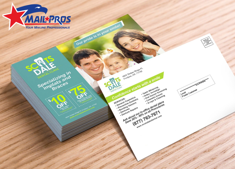
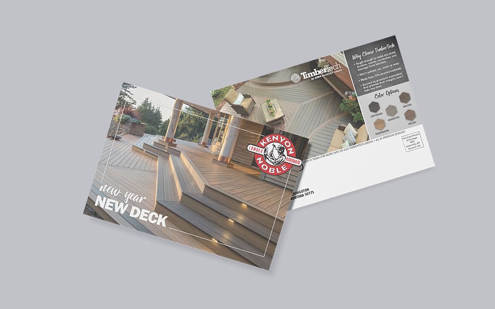
Balance Both Sides of the Postcard
A postcard has two sides, and each one should be used thoughtfully to maximize its impact. The front side is where you grab attention with bold visuals and a striking headline. The back side is equally important, offering supporting details and a clear call-to-action. Using both sides strategically ensures your message feels complete and engaging.
Think of the front as the “hook” that sparks curiosity and encourages someone to keep reading. The back should act as the “explanation,” giving context and direction for the next step. When these elements are balanced, your postcard not only captures attention but also guides readers toward action. A cohesive approach makes your message more memorable and effective.

Incorporate Branding Elements
For postcards to work as true marketing tools, they must be unmistakably tied to your brand. This means incorporating your logo, sticking with consistent color schemes, and using fonts or styles that reflect your brand’s identity. When recipients see your postcard, they should immediately know it’s from your business. Consistency builds trust and strengthens recognition.
At Mailpros USA, we understand how powerful branding can be in printed materials. Even small details, like logo placement and color accuracy, can determine how professional your postcard looks. Consistency isn’t just an aesthetic choice—it transforms a simple mail piece into a reliable brand messenger. Strong branding ensures your postcards stand out in the right way.
Pay Attention to Print Quality
A polished design won’t make an impact if the print quality falls short. Blurry images, muted colors, or thin cardstock can weaken your postcard’s message and professionalism. To make a lasting impression, your design needs to be supported by top-quality printing. The feel and look of the postcard should reflect the credibility of your brand.
That’s why working with a trusted postcard printing company is essential. At Mailpros USA, we use durable cardstocks and offer finishes like matte, glossy, or UV coating. These options elevate both the look and durability of your postcards, keeping them vibrant and long-lasting. High-quality printing ensures your message leaves a strong and positive impression.
Test Before Printing in Bulk
Before sending your postcards to print, it’s always wise to request a proof. A proof allows you to spot typos, alignment issues, or design flaws that might not be obvious on a screen. What looks great digitally can sometimes translate differently in print, so testing first helps avoid mistakes. It’s a small step that can save time, money, and frustration.
By testing your postcard design, you can refine details and make adjustments with confidence. At Mailpros USA, we provide proofs and professional consultations to help you get it right the first time. This process ensures your postcards meet your expectations and deliver the impact you want. Careful testing guarantees the final product is polished and effective.

Conclusion
Postcards continue to be one of the most impactful tools in direct marketing, but their success relies heavily on thoughtful design and high-quality printing. A postcard that is clear, visually engaging, and purpose-driven has the power to capture attention and inspire action. From colors and typography to layout and branding, every design choice contributes to how your audience perceives your message. When done right, postcards become more than just mail—they become lasting reminders of your brand.
That’s why partnering with a trusted postcard printing company makes all the difference. At Mailpros USA, we combine professional printing with attention to detail, ensuring your postcards look polished, durable, and effective. Whether you are launching a new campaign, announcing a promotion, or simply staying connected, our expertise will help your postcards leave the right impression. With the perfect balance of design and print quality, your next postcard campaign can truly stand out.