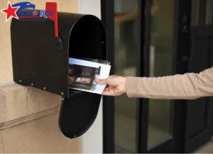
If you have ever sat down to plan a local marketing campaign, you know the specific kind of headache that comes with trying to figure out exactly who should receive your postcards. You know your ideal customers are out there probably within a five-mile radius of your shop or office but identifying them without wasting money on the wrong doors feels like a guessing game. This is where the Every Door Direct Mail (EDDM) program shines, provided you know how to navigate the technology behind it.
In my years of helping small business owners launch direct mail campaigns, I’ve noticed that the biggest hurdle isn’t the design or the budget; it is the intimidation factor of selecting routes. Using the EDDM Map Tool correctly is the difference between a campaign that generates a flood of phone calls and one that disappears into the recycling bin. It allows you to visualize your market, not just as a list of addresses, but as actual neighborhoods with specific demographics, income levels, and housing styles.
This guide isn’t just a technical manual; it is a walkthrough based on real-world experience. We are going to look at how to leverage this tool to make smarter marketing decisions, avoid common rookie mistakes, and ensure that every penny you spend on postage is directed toward a household that is likely to buy from you.
Understanding the Logic Behind Carrier Routes
Before we click any buttons, it is vital to understand what you are actually looking at on the map. Unlike traditional direct mail, where you buy a list of specific people (like “John Smith at 123 Main St”), EDDM targets specific Carrier Routes. A carrier route is essentially the daily path a single postal worker walks or drives to deliver the mail. This is a crucial distinction because it determines the granularity of your targeting.
When you look at the map, you aren’t selecting a zip code; you are selecting the sub-sections within that zip code. One zip code might contain twenty different carrier routes. One route might be comprised entirely of high-end single-family homes on the hill, while the route immediately next to it covers three large apartment complexes. If you are a roofing contractor, sending mail to the apartment complex is a waste of money. If you are a pizza delivery place, that apartment complex might be your goldmine.
This is why understanding EDDM is so powerful for local businesses. You get to cherry-pick the neighborhoods that match your customer profile without paying for the expensive data lists required for targeted mail. The map tool is your window into these distinctions, color-coding areas so you can see where the residential density is and where the business districts are.
Navigating the Map Interface for Maximum ROI
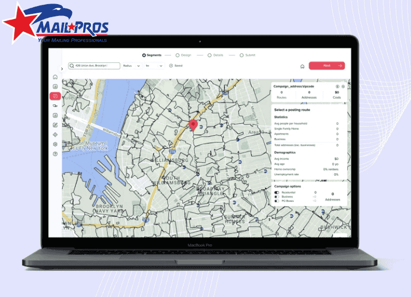
When you first load the mapping tool, it is easy to just type in a zip code and start clicking shapes, but that is a recipe for inefficiency. I always advise clients to start with a specific address usually their business location or a current job site and work outward. The goal is to build a campaign that makes logistical sense for your operations. If you are a service provider, you want to cluster your jobs to save on fuel and travel time.
Once you enter your central location, the tool will overlay a grid of routes. Hovering over a route is where the magic happens. You will instantly see data points: the number of residential delivery points, the number of businesses, and the total cost to mail to that specific loop. This immediate feedback loop allows you to budget in real-time. You can select a route, see that it costs $95 in postage, and decide if that fits your weekly spend.
However, the best feature to utilize here is the demographic toggle. Most business owners ignore this, but you shouldn’t. You can overlay census data regarding household income, age range, and household size. If you are selling estate planning services, you can toggle the map to highlight routes with a higher concentration of seniors. If you are selling swing sets, you look for households with children.
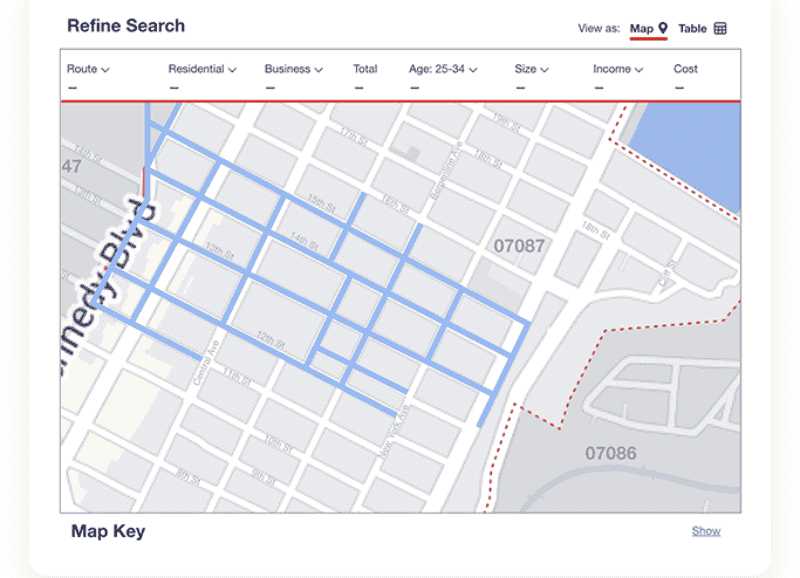
Filtering Out the Waste
One of the most practical features of the map tool is the ability to filter out business addresses. For B2C companies like landscapers, restaurants, or home service professionals delivering to a business address is usually a waste of a flyer. By checking the Residential Only option, the tool automatically recalculates the postage and removes those unnecessary stops from your count.
This might seem like a small detail, but in a campaign of 5,000 pieces, removing 500 business addresses saves you substantial money on both printing and postage. That is budget that can be reinvested into a higher quality paper stock or a larger mailer size. Efficient use of Direct Mail Marketing is about these small optimizations accumulating into a larger return on investment.
Strategic Route Selection: It’s Not Just About Proximity
A common mistake I see is business owners simply drawing a perfect circle around their office and mailing everything inside it. While proximity is good, birds of a feather flock together is a better rule for marketing. Just because a neighborhood is close to you doesn’t mean they can afford or need your services. You have to think like a hunter. Where do your best current clients live? Find the route that contains their house, and then look for other routes on the map that have similar stats.
For example, I worked with a high-end renovation company that was struggling with EDDM. They were mailing the closest routes to their showroom, which happened to be in a mixed industrial/starter-home area. We used the map tool to look five miles west, targeting routes with high home ownership rates and household incomes above $150k. The response rate tripled.
This is where utilizing Best EDDM Mapping Tools becomes essential. You need a tool that gives you accurate data so you can replicate the characteristics of your best customers. Do not be afraid to skip the route right next door if the demographics don’t align with your premium offering.
The Density Factor
Another element to look for on the map is housing density. If you have a limited budget, you generally want routes with high density (more mailboxes in a smaller geographic area). However, be careful. High density often means apartments (multi-family units). If you offer services that require the resident to own the property like tree trimming, window replacement, or solar panels you actually want lower-density routes which usually indicate single-family homes with yards.
Connecting the Map to Your Design
Once you have selected your routes, the map tool will give you a final count. This number is critical because it dictates your printing run. Unlike digital ads where you can scale up or down instantly, print requires exact numbers. If the map says your selected routes total 2,450 homes, you don’t want to print 2,400 and miss the last street, nor do you want to print 5,000 and have boxes sitting in your garage.
Knowing your precise count allows you to utilize EDDM Postcard Printing services effectively. You can order the exact bundles needed for the post office. Remember, USPS requires EDDM mailings to be bundled in groups of 50 or 100 with facing slips. Your count from the map tool dictates how many facing slips you will need to generate.
Furthermore, the demographics you saw on the map should influence your design. If you selected affluent neighborhoods, your design needs to look elegant and professional. If you selected routes near a university, your design might need to be punchier and offer-driven. The map informs the audience, and the audience dictates the creative.
Common Pitfalls and How to Avoid Them
Even with the best tools, things can go wrong if you aren’t paying attention to the logistics. One frequent error is ignoring the Drop Date. You cannot just drop 10,000 postcards at the post office on a Tuesday and expect them all to be delivered Wednesday. The post office has caps per route per day. The map tool helps you plan, but you must coordinate with your local postmaster for large volume drops.
Another issue is Map Fatigue. Business owners get overwhelmed by the data and just start clicking random areas to get it over with. Take your time. If you are wondering Is EDDM Worth It?, the answer is a resounding yes, but only if you respect the process. The time you spend analyzing the map is worth hundreds of dollars in saved postage.
Finally, double-check your selection against physical reality. I once had a client select a route that looked great on paper, but physically, it was a gated community that had strict solicitation rules (though USPS can usually still deliver there, it helps to know the vibe of the neighborhood). If possible, drive the routes you select on the map. Seeing the neighborhood with your own eyes is the ultimate verification of the data on the screen.
Conclusion
The EDDM Map Tool is more than just a logistical requirement; it is a strategic asset for any local business. It bridges the gap between a digital marketing strategy and physical, tangible results. By understanding carrier routes, filtering for your ideal customer, and aligning your print volume with accurate data, you turn a standard mailing campaign into a precision strike for new business.
Don’t let the interface intimidate you. Start with your best customers, find where they live, and use the map to find more people just like them. It is a process of refinement. Your first map selection will be good, but your second and third will be excellent as you learn which routes drive the most calls.
If you need help interpreting the map data or turning those counts into high-quality mailers that get results, MailProsUSA is here to guide you through every step of the process, from the first click on the map to the final delivery in the mailbox.